Week 8: Environmental Storytelling
- Stevie Tewfik
- May 5
- 9 min read

Updated: May 6
Since I have gotten some of my larger props ready, I thought it was time to focus on adding some more props, and a finding ways to remove repetition. I felt as if, despite my scene having quite a few props, it still felt empty. For example, the area on the right still had basic blockout meshes instead of the original desk/ table I wanted there. So, it only made sense to being with that.

Following my typical workflow, I found a nice table and chair design from one of the prop artists for the Vessel of Hatred Diablo DLC, Michael Chae. Considering I was going for a green colour palette for my level as a whole, I thought this table would be perfect.

Of course, I didn't want to copy it completely, but I drew inspiration from how the table would've been built in universe, and worked that into my design, particularly in regard to what parts were made of each material. In the end, I achieved quite a wide design, which was the aim.
One of the highlights of this model, I believe is the tabletop. I found a nordic pattern on a random Vietnamese website, much like the book pages, and converted it into a black and white image to use as a custom alpha.

Using the projection function in painter, I created an altered wood material, and gave it a slight increase in height compared to the rest of the surface it was on. This gave the effect of the wood having been built into the table instead of a trim being placed on top. I'm very happy with the continuation of the green colour scheme and. like usual, used my moss material with position and dirt generators so that the legs would more easily integrate with the floor. It's almost like my own b-tec RVT, as that is something that I want to look at in the future.

As for the chair, it was a similar process, using the new materials (converted into smart materials) to texture it. Additionally, as the table was so much larger than the chair, I decided to only use a 1k texture for the chair as opposed to the 2k texture that the table utilises.
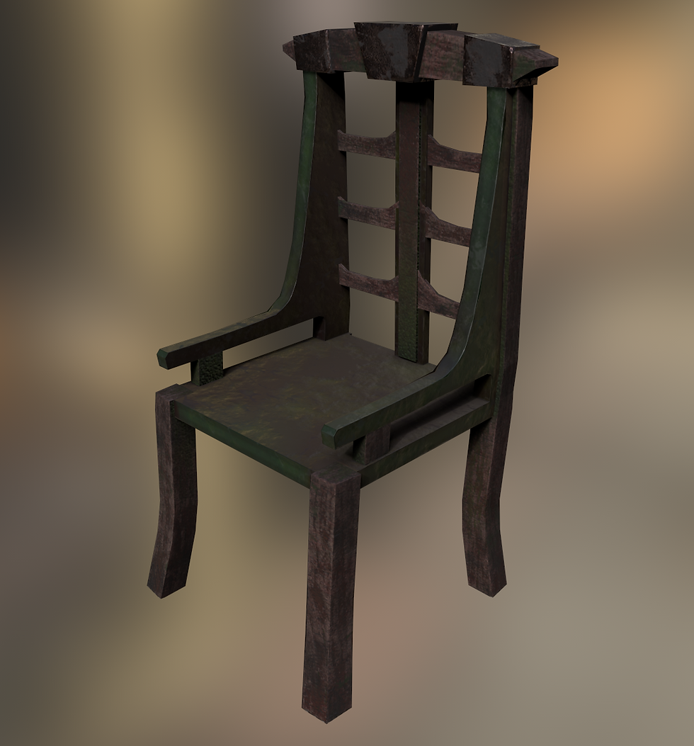
When paired together in engine, they fit perfectly together, and blend into the scene like they'd been sitting there for years.. However, the table looks oddly populated, as I created some more props to fill the empty space that the tabletop was.

Considering I had already modelled a sword for my shrine knight, it gave me an idea. This level is a dungeon, intended to have a boss fight, so surely there have to be weapons. I found a sheet of weapons from medieval times, and used that as inspiration to create these other 4 (as the middle sword is a scaled down version of the knight's broadsword).

Out of these, I chose the battle axe, claive, spiked club, and long bow (with an arrow), as you can see below.

I was able to put them all on the same 1k texture, but have them be exported as separate objects when I brought them into Unreal. Using edited versions of my wood and rusty metal texture, I created pretty convincing materials. I also reused the banner fabric material for the handle of the broadsword to add a little colour variation compared to the shrine version.

For my weapons however, I needed somewhere to store them, so I made a fancy chest just for them. Upon reflection, it echoes a similar aesthetic to my pillars, in regard to the skulls, and my emission that I included (which I will highlight next week as we are focusing on "materials"). Geometrically, it was a simple model, and the main room was getting full at long last, so I decided to place it down in the secondary room outside the boss room.

As you may have seen earlier on the table, there were some candles next to the battle axe. These are one of my favourite small assets, as they look so good considering their texture resolution is so low (only 512x512). I also used a slightly different workflow for this, something that I learnt in my character art lectures this semester, the art of retopology and the high-to-low poly workflow.
I began in ZBrush, sculpting a simple candle and accompanying wick.

From there, I decimated it and brought it into Maya. From there, I fully retopologised it using "quad-draw". I ended up with a much lower poly count of 212, compared to the original 400,000 of the ZBrush model. I then UV unwrapped and duplicated the objects (whilst grouped together) to create some variation in size.

Seeing as I duplicated the candle after having unwrapped it, it meant that all the candles would share the same UVs, allowing me to optimise the texture quality. However, I couldn't just have every candle sitting on nothing, so I created a holder for them.

This was a very straight forward model to create, especially as it was so low poly. I could afford to keep the geometry very simple as this object would be so far away from the camera whenever I present this project. I also made a high poly of this using dynamic subdivisions in ZBrush, to give it a smoothed effect, as opposed to sharp angles.

This asset also used only a 512x512 texture. You can see that the geometry is not the smoothest ever, but it's pointless adding an unnecessary number of polys to something that is a few pixel on your screen.

Another aspect of the original image of the table, is the amount of blood that had been strewn across everything, and the unusually glossy floor in the bottom left of the image. This is because I decided to include decals, something I had been wanting to look into since the early weeks of this project.
By kind donation, once again from William Pryn, I was given early access to a mural on how to create decals, which are one of the most revolutionary aspects of breaking repetition I've discovered.

It was a very simple setup, I created a blood splatter effect in Photoshop by using a simple spray can-style brush, and coloured it red on a black background. I exported that image, changed the fill colour to white and re-exported to create a pixel-perfect opacity mask. When plugged into the opacity channel, and the material preset on "deferred decal" and transparent, you get a placeable blood splatter.

Unreal lets you move and stack as many of these decals on top of each other, allowing me to create more dense and concentrated bloody areas with ease. I created a few other decals repeating this method;
A moss decal using my moss materials albedo map, and a greyscale version of it to mask it
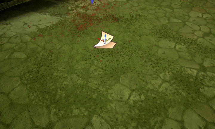
A dusty grunge decal using one the grunge maps from Substance Painter, again masked out

A puddle decal - this was slightly different as I used the "panner node" setup like my cave water, to create a gentle rippling effect.

I was able to dot loads of these 3 round my scene, at different rotations, scales and opacities which allowed for a lot of variation, whilst also breaking up repetition of my tileable elements.
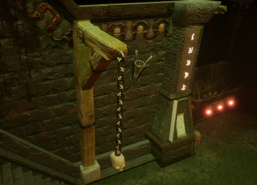
You may have noticed, above the weapons chest, there was a new type of pillar. Upon receiving some peer feedback, I was told that my walls could do with some breakup, as they were still quite repetitive. This gave me the idea to add 2 different types of pillars, to break this repetition.

I created 2 for a specific reason you will see later on. The reason why the back of these are so strangely modelled, is because I designed them specifically to connect to my wall pieces, to not waste on UV space.
They were both included on the same 2K texture considering there are 2 pillars and they have (especially the first pillar) large surface areas. I was able to stack some UV shells like the metal clasps and the rocky bases as they were identical between the 2.

As you can see below, they line up perfectly, and this "tri-pillar" allows me to hang stuff off it, and that's where we get to my "skull on a chain" asset.

I made a simple chain using 1 link element, from a modified torus primitive in Maya. I then just duplicated it and rotated it, so each chain is basically one large instance of 1 link. Then, I used my retopologised skull (the same one as my pillars and weapon chest as you can see to the right) with a chain link "drilled" into it and hung it on the end.
Considering each chain was made of individual links, it let me create lots of different chains at different lengths, some with or without the skull, reducing repetition and increasing customisability.
At this point (on Friday) I had realised I had only been focusing on the INside of my level, and not right where you begin, at the bridge. Currently, as you saw in one of my previous posts, it was just a pool of water with a plane placed above it.
The plane was a placeholder asset for the bridge I wanted to make, so I made it yesterday, and this is what it looks like in-engine. I used my normal pipeline, stacking quite a few shells this time. This helped me a lot, as I only sculpted 12 individual rocks, but copy and pasted their high and low polys around the other sections of the bridge to build up the walls.

This is what the original low poly model looked like before sculpting, considerably optimised compared to some of my other models.

By Saturday evening, I was very happy with how it was looking in game, as I had populated with all of my props and decals.

Though it still looked a little empty. Like my floors, particularly around the edges, it was almost like everything needed a skirting board, or a transitional mesh, as to not so cleanly transition between the meshes, and to make the floors appear less flat. Introducing my new favourite feature, foliage brushes...
Foliage brushes allow you to scatter instances of meshes on any semi-flat surface. They are normally used, if you couldn't already guess, for foliage like grass, bushes and trees in most games, however my project didn't have that.
I spent some time thinking, what could I dot around everywhere throughout my level, so I went back to my mood board, and saw that Diablo artists place bricks and/ or rubble on the floor, so that was my next task to replicate.


Following the high-to-low pipeline, I sculpted my rubble in ZBrush, and brought it into Maya before retopologising.

I then (of course) baked them via mesh name in Painter applied my materials and dirt generator, ending with a good looking result.

I imported them into my scene, and opened up the foliage brush menu. It was as easy as dragging and dropping the static meshes into the brush menu, and drawing around my floor. However, the perfectly clean bricks against the very mossy level didn't fit right. This is when I remembered the large stones near the GA, so I went and did a mini-photoshoot and made a contact sheet.

As you can see, all these rocks are different shapes and orientations, much like larger versions of my rubble. There is a darkness to them, though it only exists on the the top half/ whatever half is facing up, this gave me the idea to recreate this in my level.
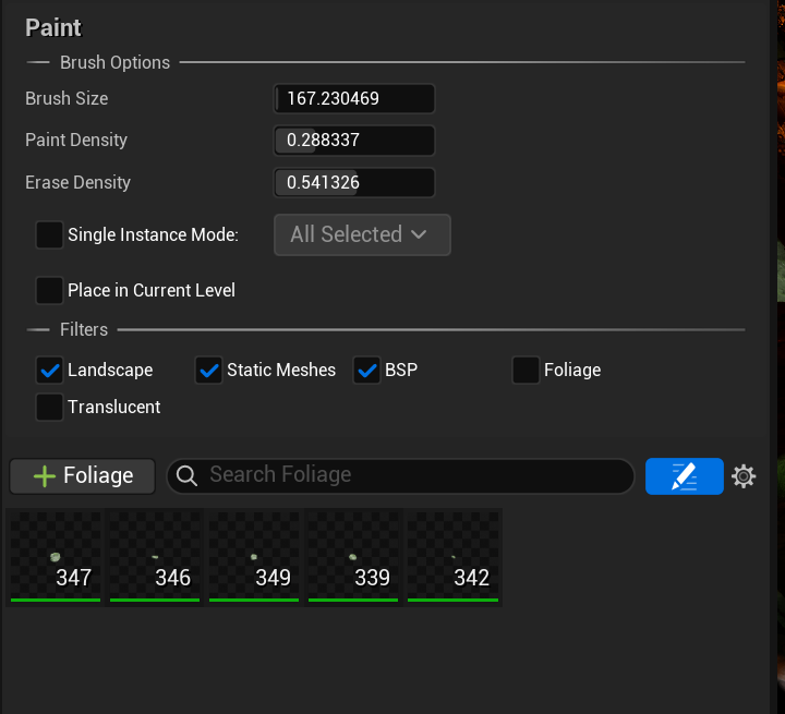
I couldn't just use my normal moss generators, as all the bricks would be at different angles and degrees of rotation. I had to make it so that the moss would only appear on the top of each brick, but how would I do that if they were all at different rotations every time I painted them on. Introducing, "World Aligned Layered Materials"...
Once more, courtesy of Unreal Master William Pryn, I did some external reading into a 2nd year mural he had sent me. I could set up a layered material that blends 2 materials together, using the world normal on each object as a mask.

This meant that I could use my moss material and my rubble material together, and no matter what rotation the mesh is at, the moss will only ever appear on the top of it. For this example I have increased the effect of the material and the size of my rocks...

Using this, mixed with the foliage brush, I was easily able to populate my scene, whether it was on the bridge, or down the stairs.


That concludes all of the work I did over the course of the week, I appreciate it may be a lot to read but I've tried to cover ever sub-process and detail!
Bibliography/ External Reading:
_______________
Chae, Michael . “Diablo 4 - Vessel of Hatred - Props, Michael Chae.” ArtStation, 2025, www.artstation.com/artwork/XJJmWY.
minh. “Viền Liền Mạch.” IStock, 30 Oct. 2023, www.istockphoto.com/vi/vec-to/vi%E1%BB%81n-li%E1%BB%81n-m%E1%BA%A1ch-gm1765029000-545231797?searchscope=image%2Cfilm.
o_cuinn. “Reddit - Dive into Anything.” Reddit.com, 2025, www.reddit.com/r/coolguides/comments/1hcdxk1/a_cool_guide_on_common_medieval_weapons/.
Pryn, William . “Decal Creation for UE5.” Mural.co, 2026, app.mural.co/t/gamesacademy5502/m/gamesacademy5502/1667481690079/4e6cb033809d9be780523149f850de5871bf5f53.
Adobe. “Grunge Maps | Substance B2M.” Adobe.com, 2019, helpx.adobe.com/substance-3d-b2m/main-features/grunge-maps.html.
Domjan, Balazs . “Diablo 4 - Season 2 - Worldbuilding, Balazs Domjan.” ArtStation, 2025, www.artstation.com/artwork/04x6k5.
Pryn, William . “World Aligned Layered Material.” Mural.co, 2026, app.mural.co/t/gamesacademy5502/m/gamesacademy5502/1762040859983/99a191338fb1d3da30f5e1c9093b8abb8b559e7a.


Comments